How to choose the right logo for your company
Developing your own company is a process that requires precise analysis of numerous aspects. Everything is important and even if something seems unimportant, it can end up being a big problem. Even the question of logo choice affects the flow of customers and the success of the project.
Overall, a logo is a visual representation of a company. And based on it, it becomes clear what the brand offers, what its history and values are, its mission, and so on. Even a simple graphic symbol makes it possible to create a strong connection with the target audience and to build competent communication.
But it’s not as simple as it might seem at first glance.
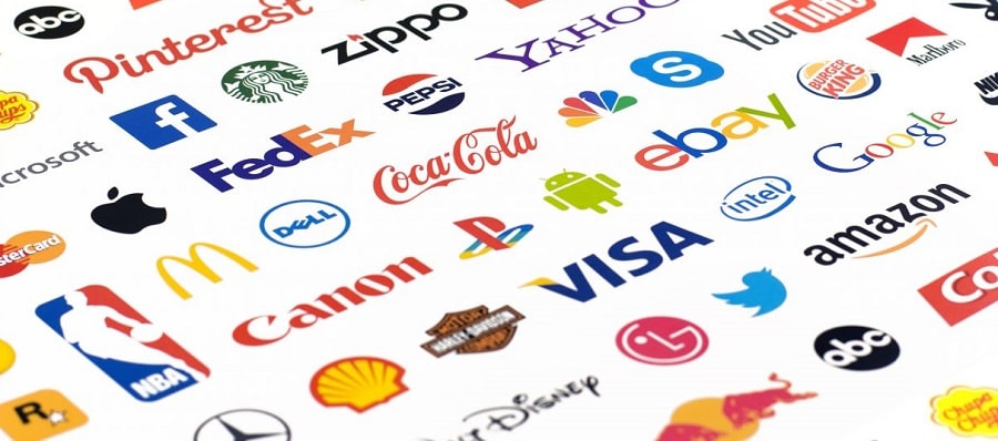
You have to think a bit about why some logos are remembered for a long time, while others are immediately forgotten? For instance, if you say apple, what do you think of? The association, of course, is Apple. And every entrepreneur’s goal is recognition and success, but what needs to be taken into consideration when designing a logo?
Why is it important for any company?
There have been numerous studies in marketing, and the results show that the average person encounters about 3,000 advertising messages every day. This is a huge flow of information. For example, social networks and messengers are simply overflowing with various advertisements, which in most cases are simply ignored by the user. And to avoid this, you need a bright logo that will certainly be remembered.
Basic recommendations on the choice
There are several important points and the most common logos:
- Textual information.
- Symbolism.
- Abbreviations.
- Emblem.
- Talisman.
- Abstraction.
- Combination.
There really is no right or wrong logo. Any of them good and each has its own characteristics. Here everyone has personal preferences, but only them in any case can not be guided.
As for the text, it is today the most popular option, regardless of the field of activity of the company and its scale. This is a modern and concise version, at the same time, simple and memorable. For originality different fonts are used, and as a basis is always the name of the company.
Abbreviations are a solution for companies with long names. Keeping it simple often leads to a positive result.
Symbolism is always a representation of brands, here again the apple is most often presented. These can be abstract logos, three-dimensional images or even hand-drawn ones.
Abstraction and its striking representative Nike. A particularly convenient solution when one wants to use an image without being bound to a specific image.
The mascot can be bright and playful, even funny. This is a basic feature of talismans and the secret of success often lies in psychology. Anyone will react better to a person’s or character’s face and will make it stand out.
A coat of arms is a logo that has some kind of specific text. It is common for a coat of arms to be used by higher education institutions or government organisations.
A combined version may include several types of logo, for example, symbols and text. For example: Lacoste or MasterCard.